Line is Value
Objective:
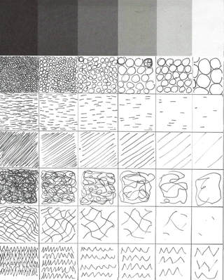
Explore the use of line to create value. Crosshatching, stippling, and invented patterns should be used to create volume in a drawing from a provided black and white photograph.
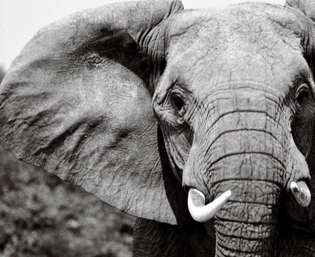
Original Photo:
Explore the use of line to create value. Crosshatching, stippling, and invented patterns should be used to create volume in a drawing from a provided black and white photograph.
Original Photo:
Thumbnails and Ideas:
|
|
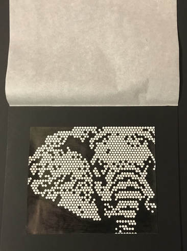
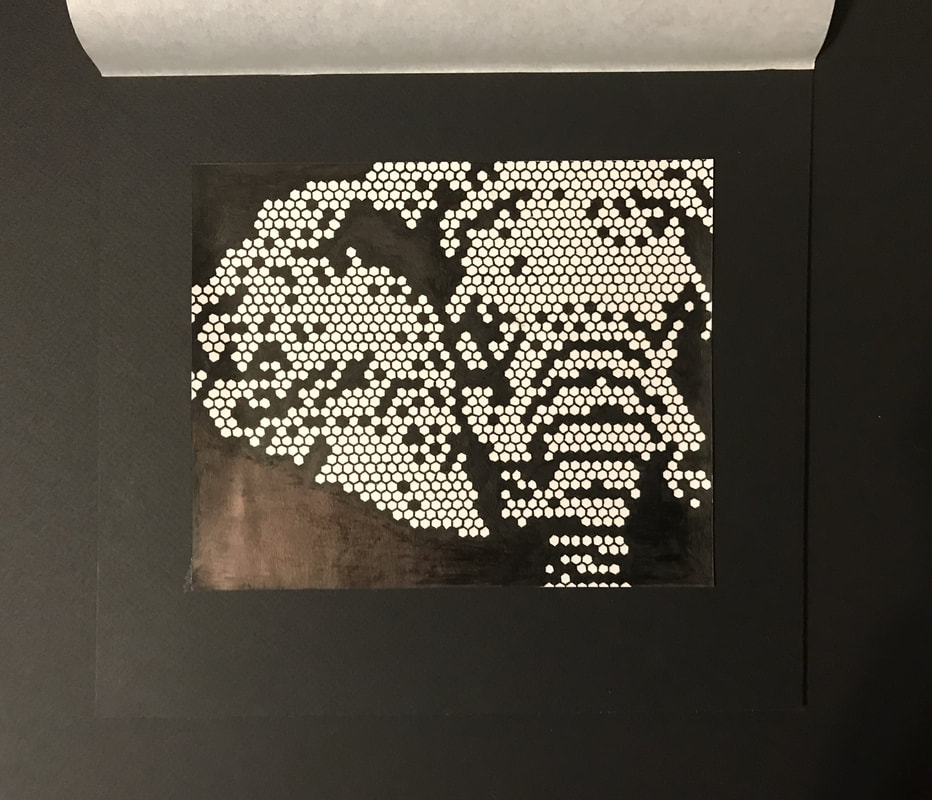
Hand Rendering and Final Project:
|
|
Final Computer Output:

Overview:
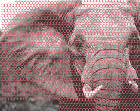
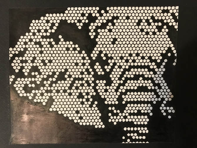
For this project I was given a black and white photograph of an elephant. I was then instructed to create a new drawing from this photo that used lines and/or patterns to convey value, instead of using typical shading technics. As I tried to think of an idea I came across a photo of a honeycomb and bees. I was inspired by the geometric shapes and lines that all connected to create such a intricate pattern. In order to achieve this look I took the hexagon pattern and photoshopped it onto the top of the original photo. I made the design red so it could easily be depicted against the black and white backdrop. I then placed this on a homemade light board with bristol paper covering the top. I traced the pattern and looking at the different values in the original picture, decided which spots of the photo should be colored black and which spots were light enough to leave white. I decided to make the background completely black to blend into the dark value of the elephant and make the whites pop even more. In the end I was very happy with how my design turned out. You can still see the elephant in the pattern and it brings a unique view to the photograph.
For this project I was given a black and white photograph of an elephant. I was then instructed to create a new drawing from this photo that used lines and/or patterns to convey value, instead of using typical shading technics. As I tried to think of an idea I came across a photo of a honeycomb and bees. I was inspired by the geometric shapes and lines that all connected to create such a intricate pattern. In order to achieve this look I took the hexagon pattern and photoshopped it onto the top of the original photo. I made the design red so it could easily be depicted against the black and white backdrop. I then placed this on a homemade light board with bristol paper covering the top. I traced the pattern and looking at the different values in the original picture, decided which spots of the photo should be colored black and which spots were light enough to leave white. I decided to make the background completely black to blend into the dark value of the elephant and make the whites pop even more. In the end I was very happy with how my design turned out. You can still see the elephant in the pattern and it brings a unique view to the photograph.
Less is More
Objective:
The objective of this project is to create a series of designs from one item. Changing, cropping, negative and positive shapes, and introduction of color will be explored.
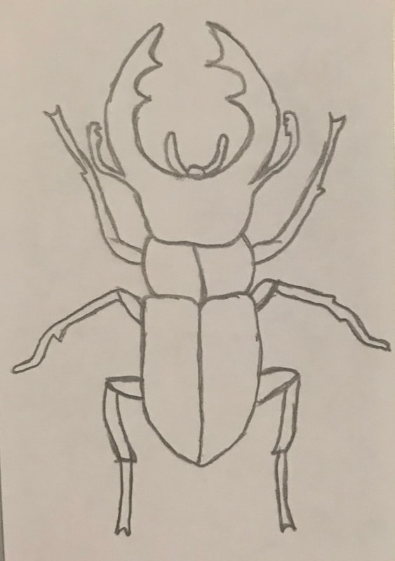
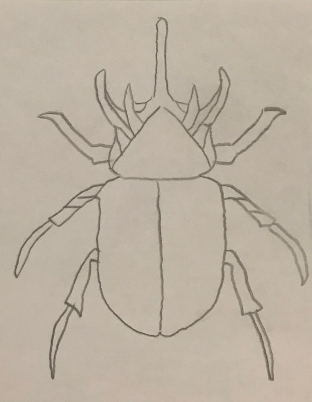
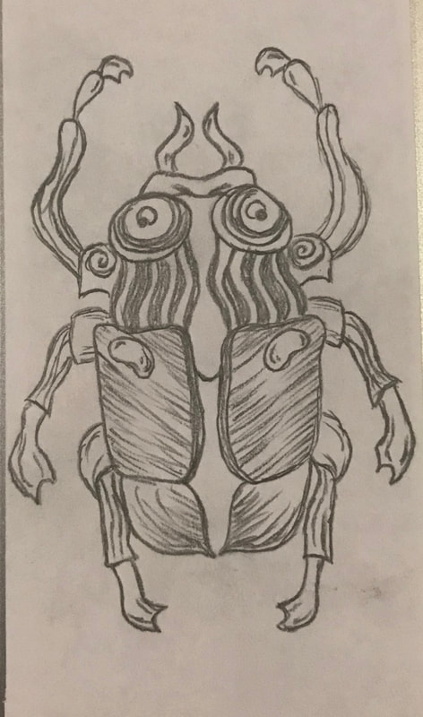
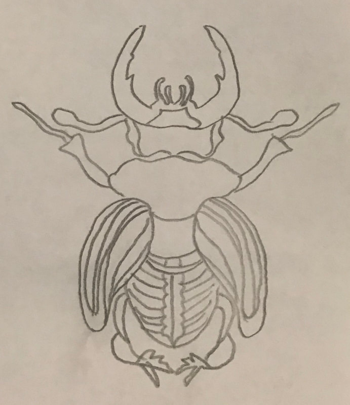
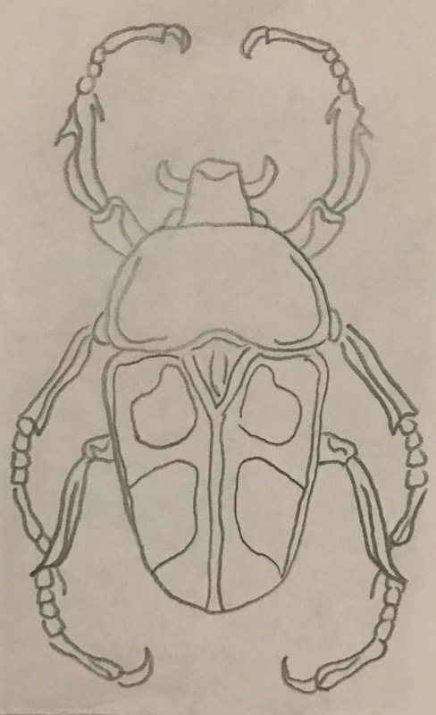
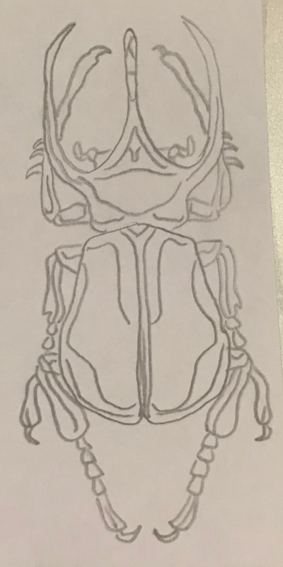
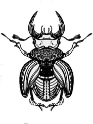
Preliminary Artwork and Thumbnails:
The objective of this project is to create a series of designs from one item. Changing, cropping, negative and positive shapes, and introduction of color will be explored.
Preliminary Artwork and Thumbnails:
|
|
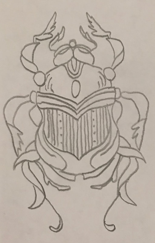
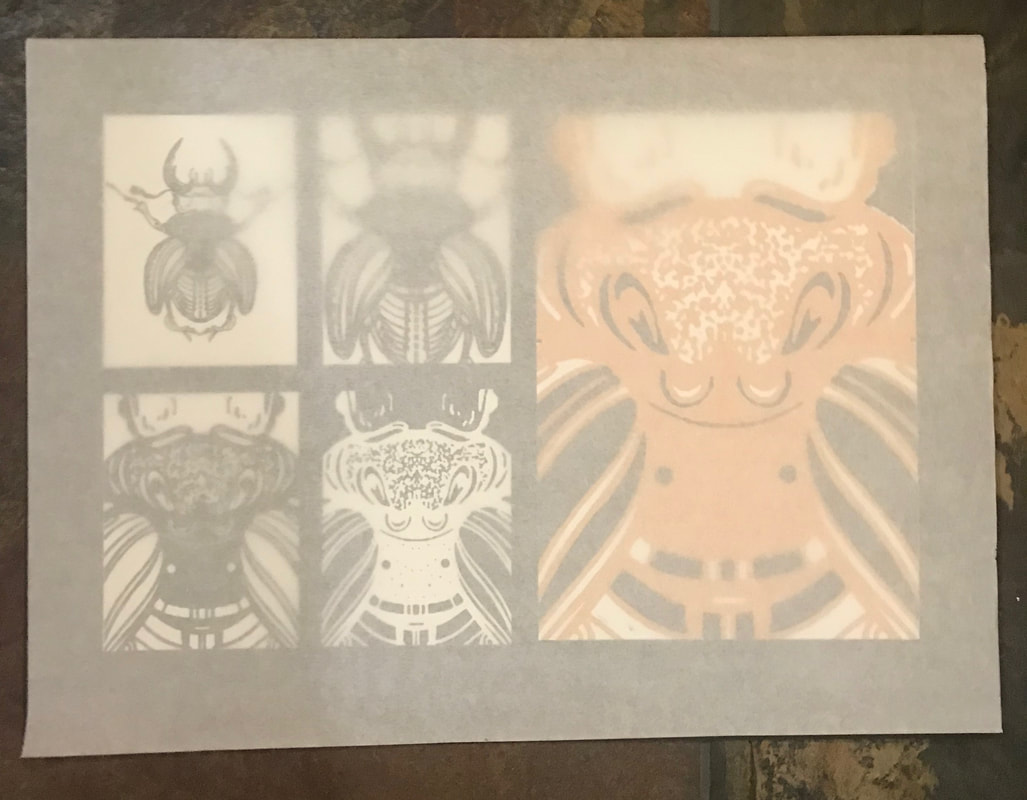
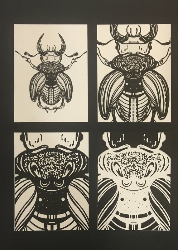
Printed and Final Project:
|
|
|
|
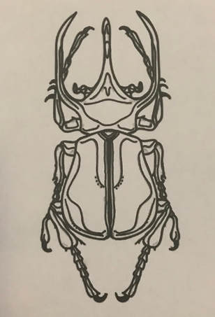
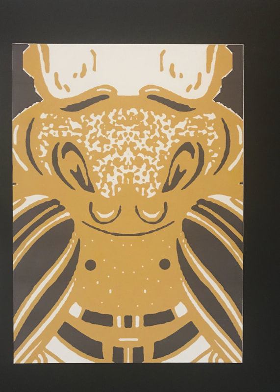
Final Commuter Output:
|
|
|
Overview:
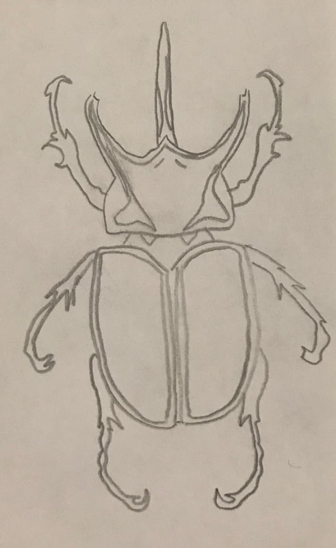
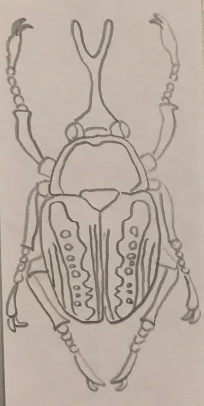
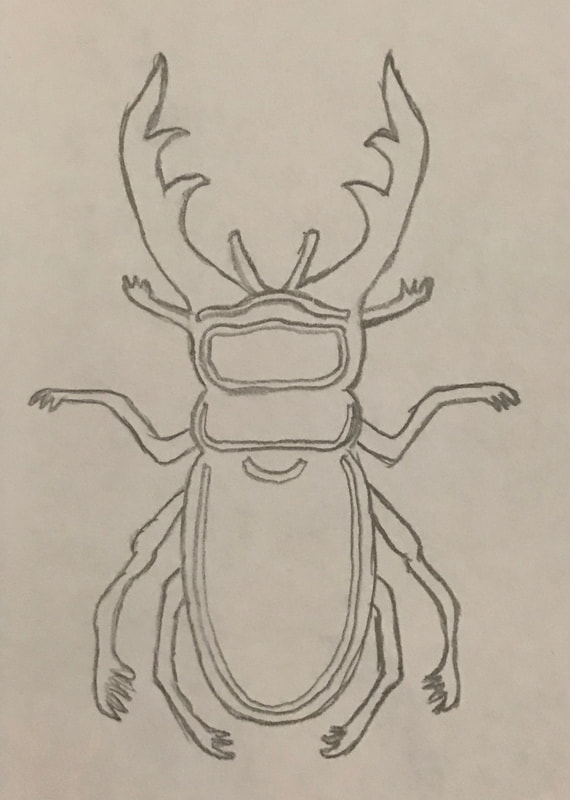
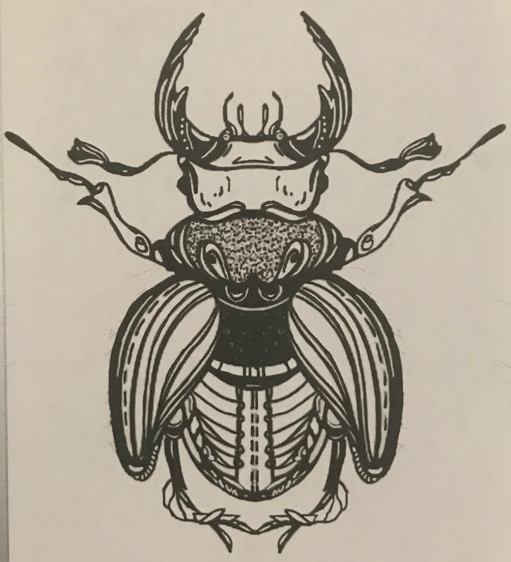
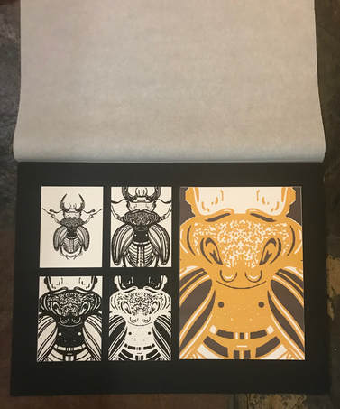
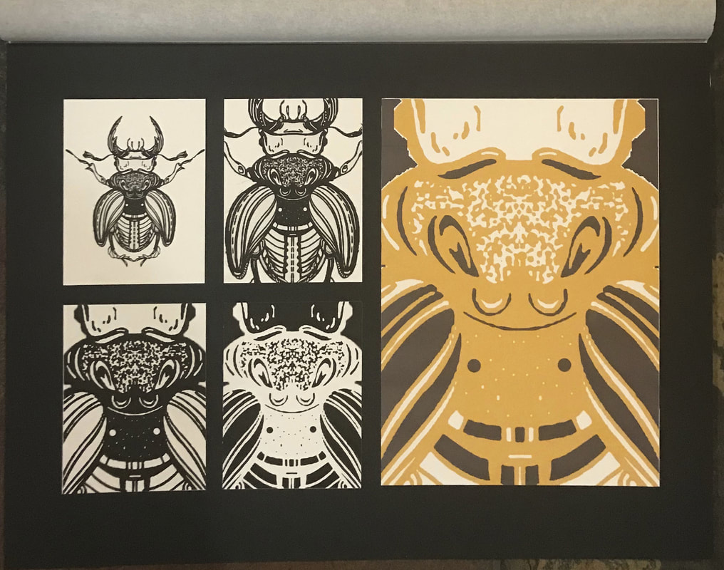
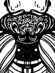
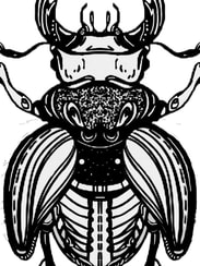
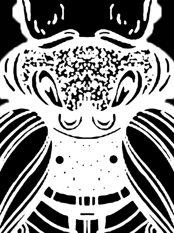
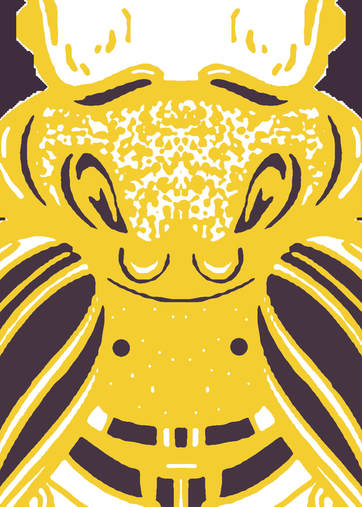
For this project I was asked to pick a plant or an animal as my inspiration and subject matter. I immediately knew that I wanted to do a beetle. I started out by sketching different types of beetles and different patterns/stylizations. I picked one of my rough drafts and decided to make it more detailed. I drew the left half of the beetle stopping at the middle line. When I had finished and finalized the pattern I wanted I uploaded the half onto the computer. From there I mirror imaged my ink drawing in order for my beetle to be symmetrical. From there I played around with different cropping options for the following three designs and ended up cropping into the body of the beetle. I believe it turned out well and shows an interesting part of the design. To pick the colors I knew I wanted it to be brighter than the black and white versions. The black and white ones were so contrast that I decided to do the opposite for the final panel. I went for two complementary colors that would stand out against each other but would not be quite as bold as the first four designs. I believe I created the effect that I was looking for.
For this project I was asked to pick a plant or an animal as my inspiration and subject matter. I immediately knew that I wanted to do a beetle. I started out by sketching different types of beetles and different patterns/stylizations. I picked one of my rough drafts and decided to make it more detailed. I drew the left half of the beetle stopping at the middle line. When I had finished and finalized the pattern I wanted I uploaded the half onto the computer. From there I mirror imaged my ink drawing in order for my beetle to be symmetrical. From there I played around with different cropping options for the following three designs and ended up cropping into the body of the beetle. I believe it turned out well and shows an interesting part of the design. To pick the colors I knew I wanted it to be brighter than the black and white versions. The black and white ones were so contrast that I decided to do the opposite for the final panel. I went for two complementary colors that would stand out against each other but would not be quite as bold as the first four designs. I believe I created the effect that I was looking for.
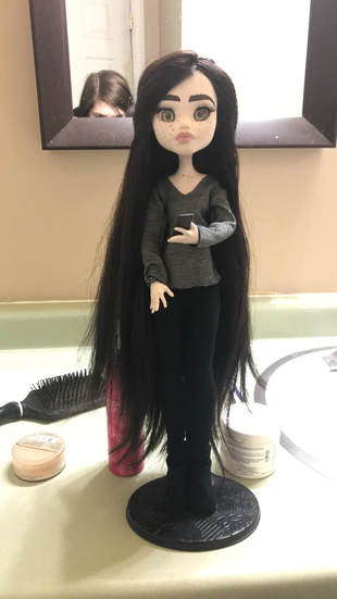
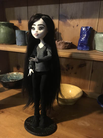
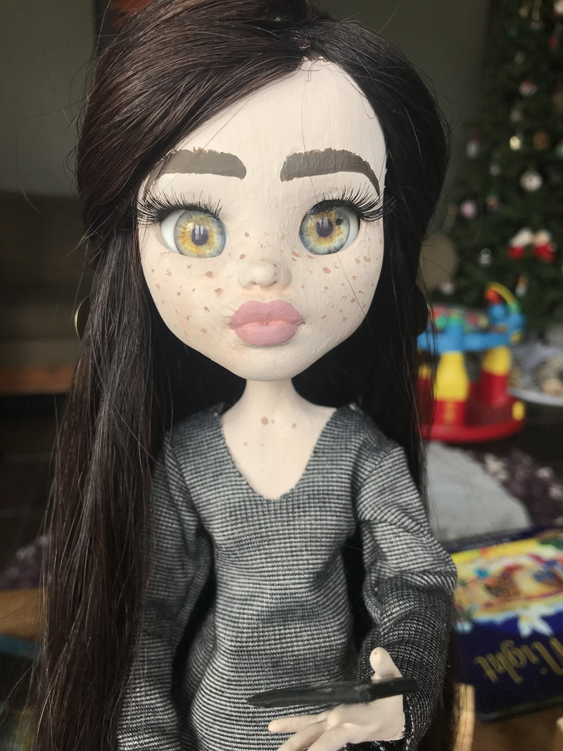
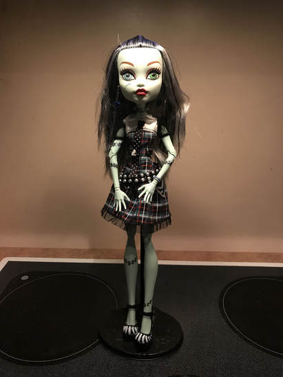
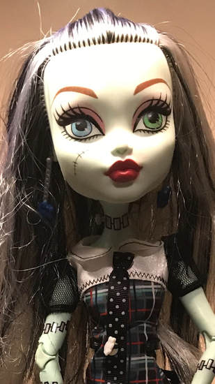
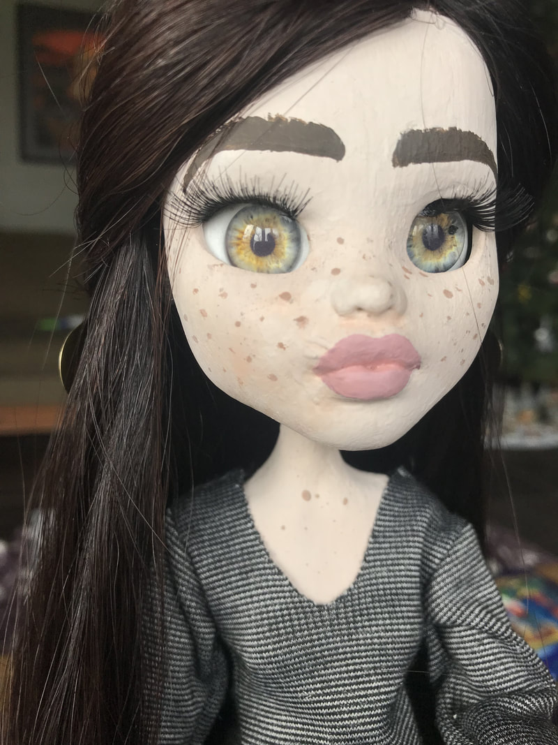
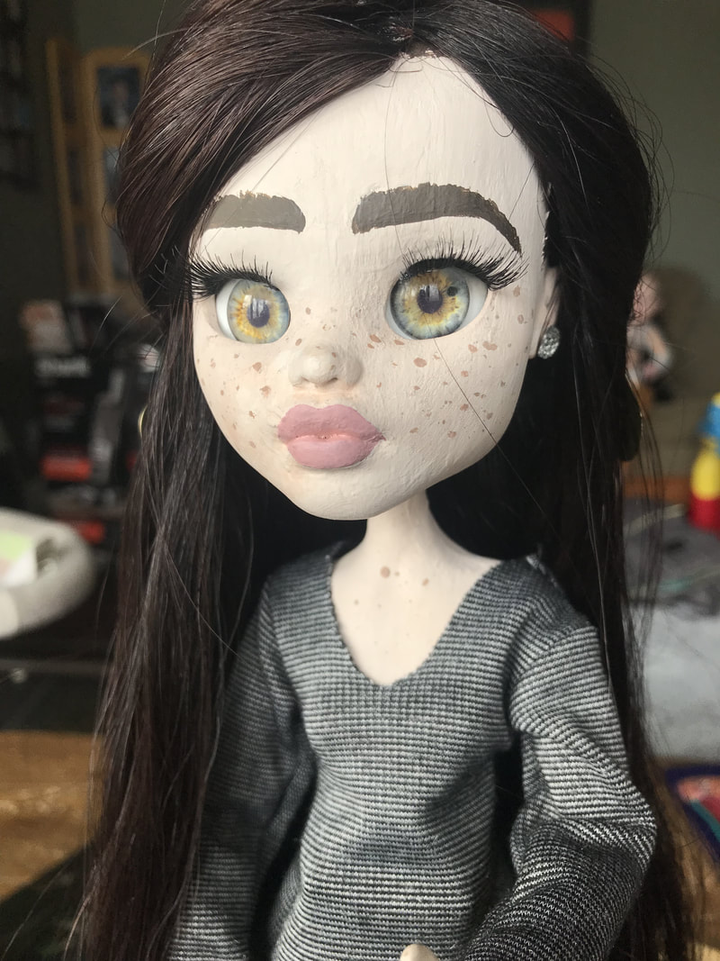
Other Class Projects
Abstract Self Portrait
|
After
|
Before

|
|
|
